Print draft feedback and learner response
Final Media Project
https://drive.google.com/drive/folders/1fv0gcrazI337vClODyDzjhZWFpHyqTAn?usp=sharing
Highlighted are ones I've done
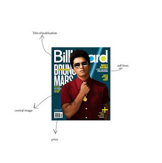
Front cover:
- Very strong cover – excellent visual style, high-quality images, consistent colour scheme. Lots to credit here!
- I’m a bit unsure what the 22 refers to?
She is asked 22 questions in the interview
- It feels a little light on cover lines perhaps?
Double-page spread feature/interview:
- Does ‘rising legend’ work? Can a legend rise? Not sure.
- Strong design across the two pages – but the image is very serious. Do you have other images or could the article/headline/subhead reflect the feel of the image?
I don't have any other images
- Look at the layout of questions – it feels like Q1 should be where Q3 is?
- Column width inconsistent – was this created on Photoshop or InDesign
When creating consistent width it looked off
- Written English needs checking in places
- Not sure on the two images bottom right – what are you trying to achieve with those?
Tour poster
- Am I missing something – is the artist title on there?
- In general, it feels like it is missing a few conventions although the dates and venues look great.
- Could you incorporate the headphone sponsorship in a more creative way?
Not sure how to since I don't have any photos with me wearing the headphones


Comments
Post a Comment